
Ask the expert: the importance of mobile optimisation in ecommerce
As consumers become increasingly more comfortable with making purchases via mobile devices, ecommerce businesses must respond by improving their mobile experience. Business insider forecasts that by 2020, mobile will account for 45% of all total ecommerce sales. [Source: BI]
Space 48 Head of Insight Oliver Lees discusses the importance of mobile optimisation in ecommerce, outlining the changing consumer trends and offering his recommendations for getting mobile ecommerce right.
Why is mobile optimisation so important now in ecommerce?
Consumers have high expectations for their mobile experience
Mobile shopping has made huge leaps in recent years, as users become increasingly more reliant on their smartphones and mobile devices, especially as capabilities continue to advance.
Google searches on mobile devices have now outgrown desktop online search, whilst mobile sales accounted for 36% of total online sales on Black Friday in 2016. So, retailers and ecommerce businesses need to step up their focus on mobile optimisation.
As Amazon continues to blaze its trail, consumers expect their products and brands to be easily discoverable, so your browsing experience on mobile needs to be quick and easy. Once one retailer unveils a game-changing new feature, consumers expect that same functionality elsewhere and other retailers have to play catch-up – the same trend applies to social networks copycatting each other!
Social media is having a big influence on mobile ecommerce
Mobile shopping growth is closely aligned with social media trends. Brands and marketers are responding with increased targeting through paid social ads and personalisation, based on user data and behaviours.
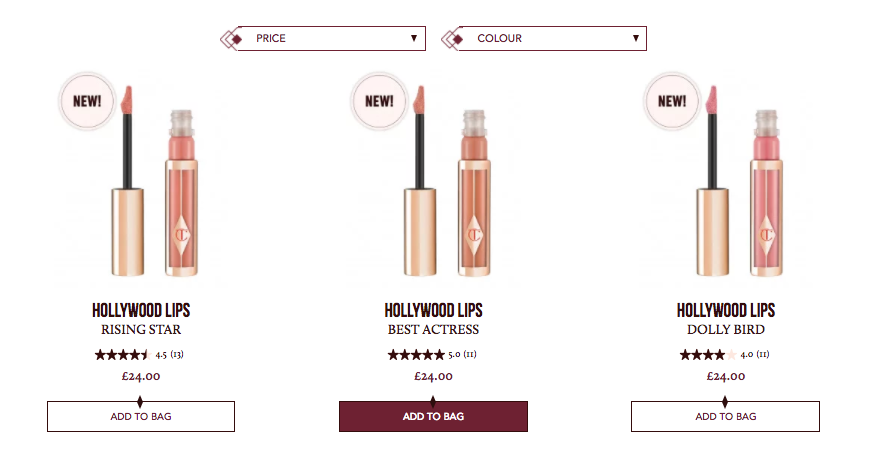
Social engagement and interaction with brands has heightened, due to the impact of brand storytelling, influencers, social sharing and user generated content (UGC). A great example of this close relationship between brand and customer is Charlotte Tilbury’s “Tag Your Tilbury” and Gymshark’s “Shop Our Instagram” feature. Users can tag themselves in selfies posted on Instagram, Twitter or Facebook wearing their products. Selected posts will be shown on the site, and users can click through to the featured products to purchase them. See example below:

Retailers and social networks are making it easier to purchase products directly VIA channels and apps, leading to more mobile conversions.
Mobile sites vs mobile responsive pages
Google want its users to have mobile-specific experiences and consumers want seamless user experiences whatever device they’re using. Mobile-responsive sites are still valid, but when deciding between a mobile site or mobile-responsive pages consider your:
- Budget
- Level of control
- Industry/product types
- Level of mobile usage according to your customer behaviour analytics.
Whichever route you go down, you should have a “mobile-up” mindset. Here are some mobile-specific tactics to consider:
- Remove distractions from the route to purchase
- Optimise your page view for mobile
- Although mobile sales are growing, users buy less products on mobile – don’t focus as much on upsells as consumer make short-term decisions
- Use AdWords with mobile browsing in mind – mobile conversions are much lower than on desktop due browse-now-buy-later trends
- Focus on your own audience – mobile browsing behaviours vary depending on your own industry, products and demographics
- Tailor your personalisation to mobile activity and consider your space/capacity – Nosto can help with responsive personalisation for mobile

How to optimise your ecommerce website for mobile: UX tactics
Let’s look at mobile optimisation from user experience point of view. We’ve outlined 10 top UX mobile optimisation tactics:
1. Work with experienced UX designers and ecommerce agencies to improve user experience on all devices
2. Implement a well-built responsive grid with breakpoints tailored to design not devices
3. Understand varying mobile user behaviours when considering customer journeys
4. Ensure CTA buttons are the right size with active states and appealing animations
5. Use your active screen space well – don’t put calls to action where the thumb can’t easily get to!
6. Input validation messages and warnings to help users fill out forms and take actions
7. Think about your audience and put your customer needs first
8. Don’t just focus on exit pages, look at whole customer journey
9. Work with devices not against them – retain native functionality and behaviours that consumers expect from their browser/operating system, such as dropdowns, tap-swipe and pinch-zoom
10. Be minimalistic – good UX designers subtract from their work, they don’t add more!
Remember to mobile optimise your integrated channels
Once your ecommerce website is fully-optimised for mobile, don’t deliver a bad mobile experience on your acquisition channels and marketing channels. Research your customer browsing behaviours across channels and devices and deliver an omnichannel commerce experience, which seamlessly feeds customers back into their brand journey from browsing on one channel or device to purchasing on another.
Summary
We’ve demonstrated the importance of mobile optimisation in a consumer-led ecommerce industry and armed you with the best mobile strategies and top UX tactics, to meet modern consumer expectations for browsing and buying via mobile devices. Now, time to get to work!
Space 48 is a leading UK ecommerce consultancy and Magento website development agency. Our ecommerce experts have helped countless retail brands implement award-winning ecommerce strategies. Want to learn how major retail brands are creating cutting-edge customer experiences? Download our deep-dive report into the top omnichannel fashion retailers now and get inspired!
How to win at omnichannel retail: lessons from 5 top fashion brands