How to boost ecommerce sales with immersive content (with examples)
Coauthored with Chris White from Styla.
Today, brands throughout Retail are giving significant weight to the User Experience (UX), Content and Design. The aspiration? To create digital experiences that delight – journeys that make it easy for the customer to find the right product, at the right time.
Sounds great on paper. And it’s a ‘to-be-expected’ phenomenon when you consider that 38% of online shoppers will leave a website if they find the design to be ‘unattractive’.
However, the reality is that limited budgets, a lack of internal resources, and current tech stacks make producing high-quality content a challenge. As such, fixed templates have led the way. Rinse and repeat tactics that have stifled innovation and left sites feeling uninspired for new and curious customers.
So what’s the alternative? Can you break that repetitive cycle to deliver great content, scale-up production and drive more sales? Styla and Space 48 think you can. So we’ve teamed up to deliver these easy-to-implement tips to improve the experiences of your site.
The Welcome Party – Homepage Content
“If you’re not talking to your users, you’re not paying attention to UX.” once said Space 48’s Lead Designer, Anna Green in 2017. And, low and behold, it still rings true today.
Good homepage design is the result of asking users questions, and interpreting their responses into a UI that makes the most sense for them. It’s not what the CEO likes, but what paying customers like. Accepting this can be game-changing for your brand.
Good retailers use the homepage to direct customers to new products and promotions. That’s a given. Ecommerce leaders also push social, editorial and guided selling tools. That’s the value-added. They understand that content can enhance discovery and enable customers to find their perfect product.
These are brands doing it well.
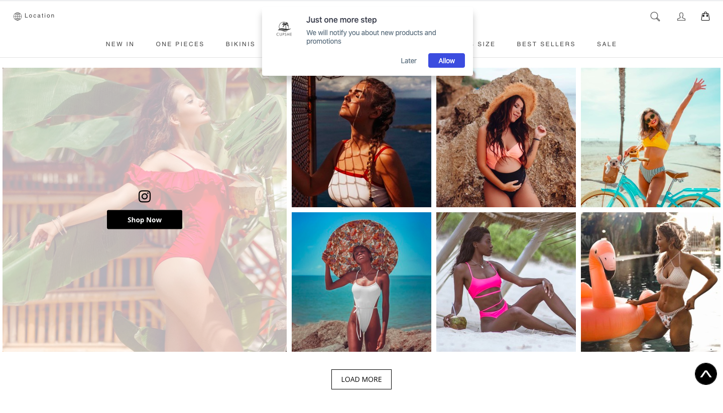
- Cupshe has added social content to the homepage, integrating shoppable functionality. By making the customer the ‘main character’ in the brand’s story, they’ve been able to build trust and increase product discovery.
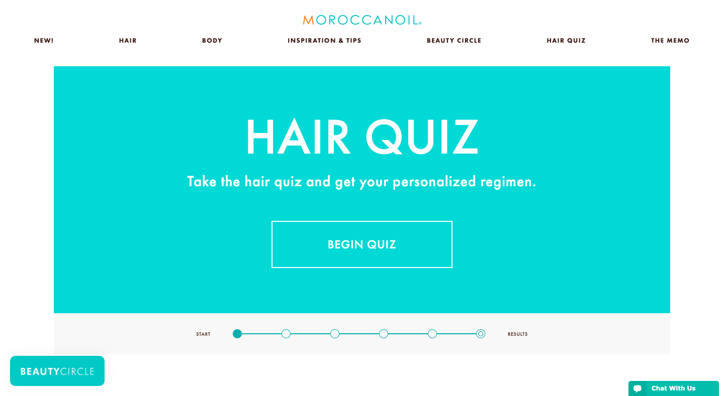
- Moroccan Oil helps customers find the perfect product through this guided content experience that displays a product in response to a series of questions. It’s a refreshing and interacting way for customers to access products.
Need sales? You need high-performing landing pages that convert
Retailers want to sell more products. It’s why we’re all here. And marketeers, they want the freedom to promote these products in new and unique ways. This can be difficult to realise due to a lack of developer resources and time. Add in the fact that these pages have short life cycles, and average conversion rates of 2.35%, it’s harder than ever to get buy-in.
It’s a vicious circle. And more common than you think.
Yet, that doesn’t have to be the reality. Landing pages that are well designed, relevant, and timely can drive revenue and boost conversion rates up to as much as 11.45%! That 600% increase can be monumental for brand targets. Page layout and content solutions discussed in-depth here on this webinar.
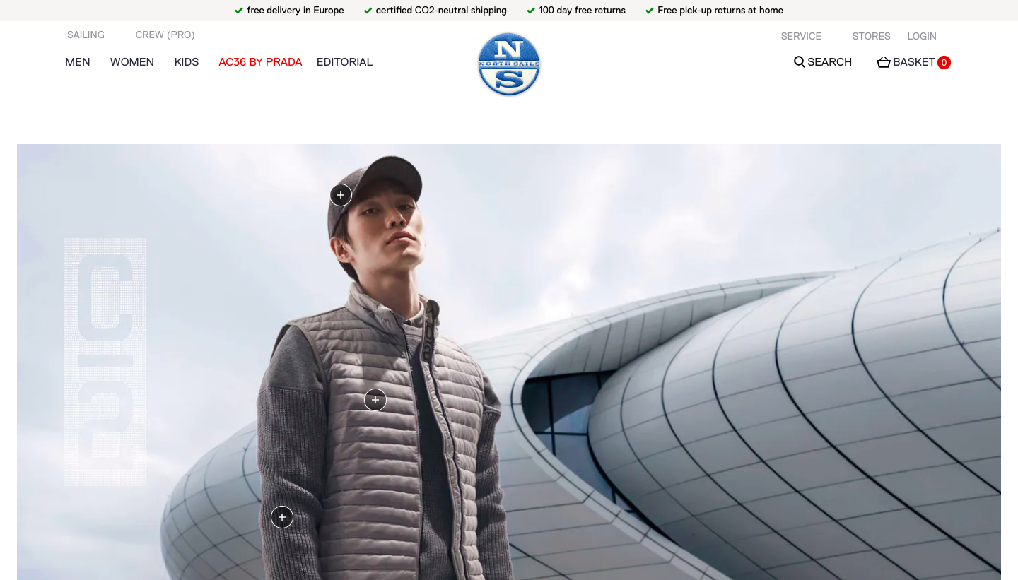
For example, North Sails are directing traffic to this landing page via social and email marketing. Rather than the standard product grid, they provide more of an immersive digital experience by creating a shop within the landing page. This approach has led to an increase in average order value and engagement.
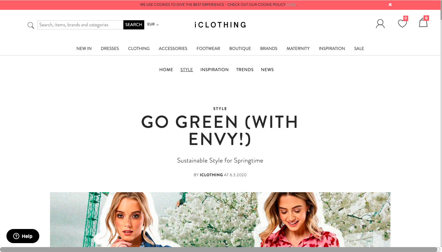
Similarly, iClothing publishes a new trend and style guide most weeks. This consistency drives customers back to the same destination, more often. It’s a great demonstration of how engaging editorial content can drive revenue.
Merchandise like a master – Product Listing Page Content
Product Listing Pages are, often, the second step in a buyer journey, with Nosto estimating that 50-70% of customers are inspired at this stage. The Product Listing Page is, therefore, prime real estate to turn customers from browsers into buyers.
Unfortunately, they’re also some of the hardest to optimise in terms of design and performance. They can be easy to over-clutter, causing the customer to be overwhelmed. On the flip side, if you don’t have enough content, customers can be left misinformed or confused.
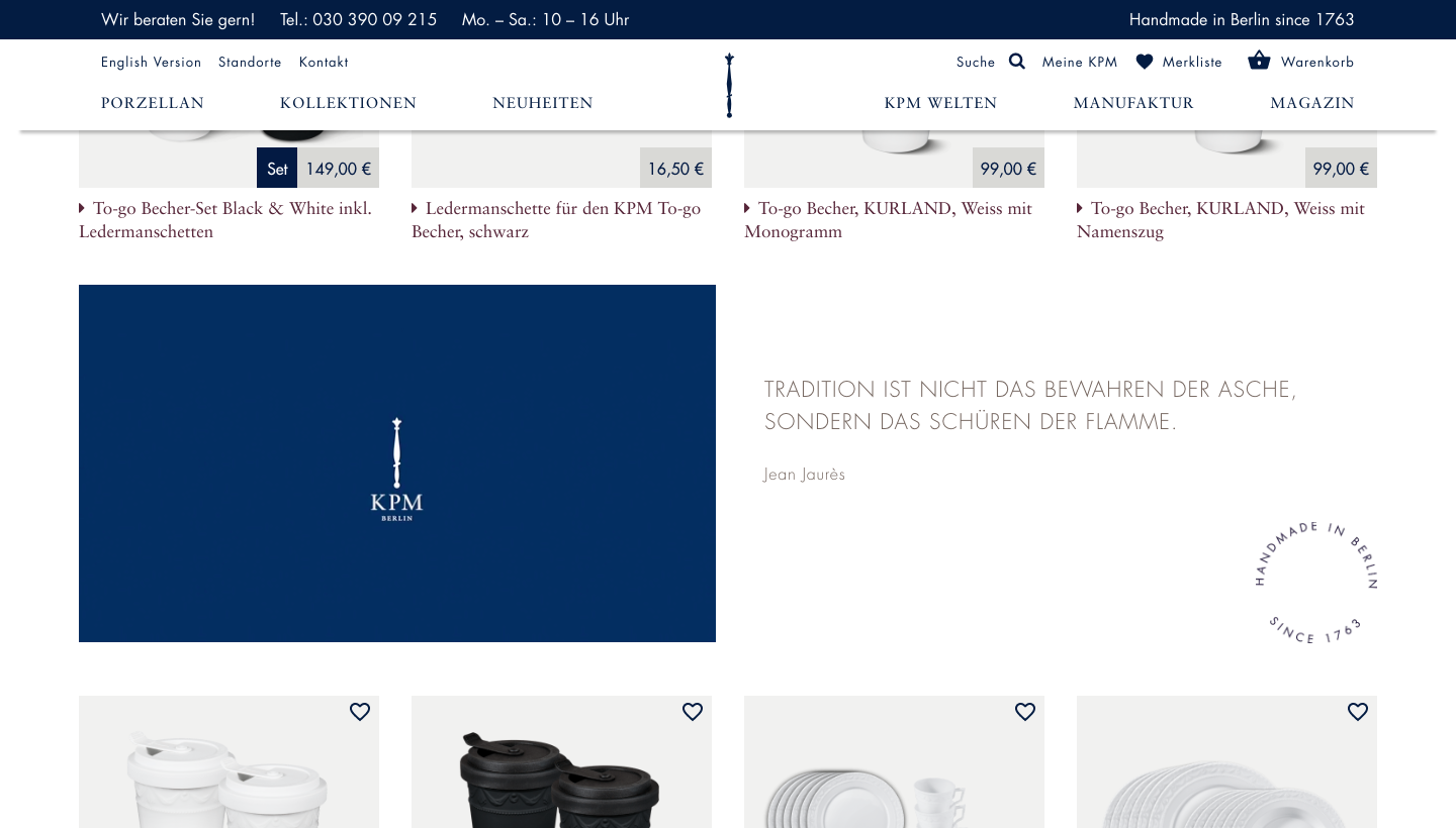
Our first top tip would be to inject social, video or promotion content in the infinite scroll on Product Listing Pages to fully optimise and inspire customers. As seen by Styla’s customer, KPM Berlin.
The second top tip is to review your user experiences and build pages around these. For example, if users arrive from Google Shopping or a product-related search, it’s important to enable users to continue browsing those products or similar on your site. Be sure to cross-promote products of interest to keep it super personalised and focused.
Setting the expectation on the Product Detail Pages (PDP)
The product detail page is where your products take centre stage. Here is an opportunity to marry strong visuals, with compelling copy to woo your customers. Give as much information as possible – avoid hidden costs further down the funnel. Set the expectation now and reduce abandonment later.
Embedding social galleries into the PDP is a great way to show your customers as the “main characters” in your brand’s story. Authentic, user-generated content is foolproof in showing how products are being used to add value.
Another quick-win on the PDP is to tell your audience how many people have purchased this product in a certain time frame. This sense of urgency can compel audiences to make a snap decision and invest in your product.
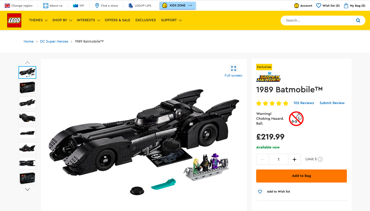
Reviews are also a tried and tested way to build trust with customers. According to a study by the Bazaarvoice network, one product review can result in a 10% increase in sales and 200 reviews can result in as much as a 44% increase in sales. Lego is a brand that does this well.
Final Hurdle – The Checkout Page
The checkout process can either make or break a sale.
Have you ever been to an ecommerce store and added something to your cart only to be faced with a clumsy checkout page that throws on unexpected costs and bombards you with forms to fill?
Yup. Us too.
And so have thousands of other consumers. Cart abandonment is responsible for an estimated $4.6 trillion is lost in ecommerce sales and the biggest culprit is hidden shipping costs and fees.
- Hidden shops costs and feeds caused 55% of shoppers to abandon their purchases.
Our tip is to experiment with adding friction at the checkout. Space 48 tested this with Charlotte Tilbury to great effect. Encouraging existing users to sign in before the checkout allowed for a more seamless, personalised experience that improved mobile conversion rates by 54%.
What’s next?
Well, there we are. Plenty of work to sink your teeth into for the foreseeable future. Toy around with some of the suggestions, and experiment to see which implementations work best for your customers. Get to grips with one at a time, instead of bombarding your site with changes on an ad hoc basis. Considered ecommerce purchased require careful, considered changes.
Do you want to learn more about creating a unique brand experience? We’ve created an e-book which hands you the most effective strategies for more engagement and conversion on your site. Download it now!