Lessons learnt from User Testing at Space 48
I have worked in ecommerce for almost a decade now. My role as consultant, adviser and evangelist is somewhat based on the assumption that I know roughly what I’m talking about, and yet, like everyone else, I don’t know what I don’t know. Thank god that we have user testing to prove me wrong.
“How well we communicate is determined not by how well we say things, but how well we are understood.” – Andrew Grove (Former CEO of Intel)
Coming from the development world, I’m fond of reading usability studies from the likes of Baymard and Nielson Norman. Most of the advice is clear cut, giving me black and white, globally applicable rules to work to which appeases my logical side. The insights are invaluable but if your user experience audit relies on these alone it can lead to over-simplification and lots of misunderstood customers and missed opportunities.
The power of user testing is in how humbling an experience it is. Indeed, as many times as you feel that your hypothesis is validated, there are many more times that you learn something new about how the information that you’re communicating to customers is being received. It requires you to remain open minded to outcomes that you weren’t expecting. Perhaps even something that you spent a lot of time pitching for or working on just isn’t working and you have to fight to avoid the sunk-cost fallacy.
What we’ve learnt through user testing
We offer user testing as a service to our clients and since joining Space 48, I’ve learnt a lot about their value by working with our Creative Director, Anna Green. She’s conducted tests for merchants at different phases of the website life. They might be undertaken as part of an onboarding audit, as part of a preparation for a re-design, or as part of a regular UX-checkup.
“If you’re not talking to your users, you’re not paying attention to your UX. It’s easier than you think to get started and once you do you will never look back!” – Anna, Creative Director
I’ve spent some time going through the user testing videos and audits to learn more about the process as well as to gain insight into what we’ve learnt so far. Out of respect of the brands that we work with, I’m not going to mention any names, but I don’t think any fidelity is lost into the insights and value of user testing.
Brand Discovery and First Impressions
The first step of many of the tests that I watched was asking users to browse the homepage and ask for their first impressions, e.g.:
- What sort of products do they sell?
- What is your first impression of the quality of the products?
- What price point are you expecting?
These sorts of questions are exactly the kind of questions that a new customer is going to ask themselves as they arrive on your site. Ultimately, the answer to the following question determines whether they stay and for how long: Am I likely to find what I need here?
It was eye-opening to me how critical the communication was, particularly on landing pages. New customers don’t know you and they are making split-second judgements on who you are and what you do. How dire would it be for customers to misread and think you don’t do something when you do! This reminded me of the recommendations to show a range of your product catalogue and categories on your homepage. It helps customers build a mental model of who you are and what you sell.
Product Research
Closely related is the feedback that you can get on products. As users are following product discovery tasks, they are performing comparisons and making comments about the information they’ve been able to find on each product and explaining their choices.
While you might readily think of user testing as a way of receiving product feedback, it was incredible to hear a customer’s thought process of why they preferred one item over another and how they came to that decision.
Building Trust
When asking users about how much they trusted the brand, it was interesting to hear the way that they presented their answers. As many of the users weren’t familiar with the brand prior to the session, most people said that they trusted the brand more by the end of the test.
When explaining why they trusted the site, most commented on the use of professional photography, particularly if it included models or were lifestyle shots.
The next most common reason given for why they trusted the site was that it had “good design”, “was easy to use”, and “didn’t have any issues”. It’s often said that trust is earned but in the way that users were responding here, it suggested that there was a comparison made with other websites and that there’s a basic assumption or expectation that the site is trustworthy until the user runs into website bugs or design issues that make it difficult for them to complete their task.
Naturally, we take these comments with a pinch of salt as one could argue that users are more likely to comment on a site being trustworthy because a company has spent money user testing it!
Overlays and Fixed Notices
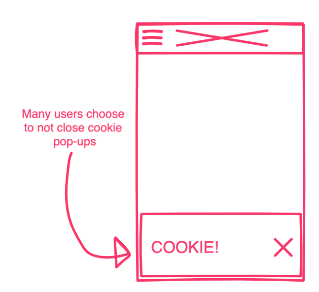
One thing that I was taken aback by was the number of users that didn’t dismiss floating (fixed position) notices such as cookie policies. On mobile, this was particularly apparent as on some sites it left very little screen left to browse the site.
With all the buzz around progressive web apps, more sites are using app-like design features such as a permanent basket at the bottom of the screen on mobile. The downside of this right now is that it’s not typical for customers to have experienced that while browsing the web. We saw multiple users scroll up and down the basket page looking for the button because it was “just another” item at the bottom of the page with the cookie policy.
“One-Step” Checkouts
A personal concern of mine in the past has been the trend of one-step checkout style solutions being implemented with little testing on their usability. When testing a three-column one-step checkout for a merchant, the initial customer reactions were eye-opening and included:
- “Oh gosh, this looks a bit busy body”.
- “Wow, ok”
- “I wouldn’t mind more steps if it meant a better experience”
With that being said, the effort that the teams behind these checkouts have invested to also reduce the number of interactions and inputs needed to complete an order paid off; after the initial surprise, most users had few problems completing the checkout.
Other not-so-surprising findings
- Users found it silly choosing product options when there was a dropdown with only one option in it e.g. the “One-Size” size option. See Baymard on Dropdown Usability,
- Depending on your business there might be some fields that customers are surprised that you need to ask for, e.g. date of birth. There may be a perfectly good reason for this, e.g. age-restricted products, so explain why in a note below the field or in a tooltip.
- Organising product information into tabs made it more likely for customers to miss it, especially on mobile.
- Strict validation on telephone fields can make it difficult for international customers to complete. See Baymard’s recommendations on form field validation.
- Generous returns policies are standard in some verticals, especially fashion and users are hesitant without it.
- A lack of cheap shipping options detracts from the offering, especially if the products can be bought with free or subscription delivery elsewhere, e.g. Amazon Prime or Asos Premier Delivery.
 Users found it silly choosing product options when there was a dropdown with only one option in it e.g. the “One-Size” size option. See
 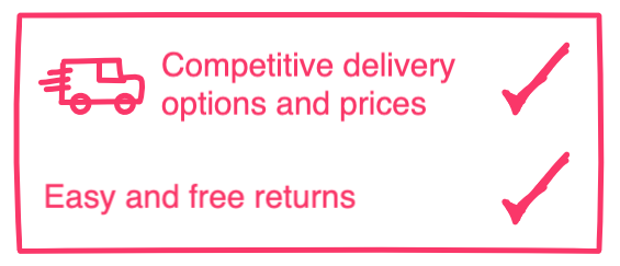 Generous returns policies are standard in some verticals, especially fashion and users are hesitant without it.
As you can see with the range of issues highlighted, there’s a lot to be gained from using the think-aloud protocol to get on-the-job feedback from customers as they complete tasks on the site. Hopefully you’re convinced, or at the very least intrigued into giving it a go, so let’s have a look at the range of tools that are on offer.
Tools
One thing that makes getting started with user testing easy is quite how many tools there are available. You’ll have a lot less hassle finding a tool that suits you than prioritising the time to undertake user testing.
Session Recording
Some of the quickest and easiest user testing tools to get up and running with are those that can record customer’s sessions as they navigate the site and then provide reports in the way of videos and heatmaps. These can be set up with a JavaScript snippet and don’t affect the customer journey.
Some examples of this include Full Story, Crazy Egg, Mouseflow, Inspectlet and Hotjar. Having used Full Story most recently I can say that it’s great for beginners with no UX knowledge. Once it’s up and running, you can watch real users and note how they navigate the site, how far they get through the customer journey, and what sort of problems they run into.
As I see it, there are three main drawbacks to these kinds of tools compared to “real” user testing: they’re not controlled tests, you don’t get insight into the customer thought-process, and it’s easy to be overwhelmed with the number of recordings.
The first is the obvious: it’s not a formal test, so even if you have a hypothesis, you can’t architect a set of questions and tasks like you would in a controlled test that would help you validate it. You are left to hunt for evidence, either way, across all user sessions. On top of that, as every session is recorded, you can be inundated with sessions so it requires some organisation to select which videos to watch. Full Story does combat this by allowing you to search sessions for particular types of journeys and behaviours, including “rage clicking”(!).
Customer Surveys
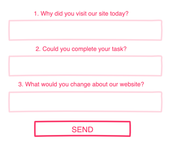
Conducting a customer survey with a tool such as SurveyMonkey is a cheap and easy user testing technique so a great way to get started if you haven’t done anything to date.
In its simplest form, you just need three questions, for example:
- Why did you visit our site today?
- Could you complete your task?
- What would you change about our website?
This can be conducted almost immediately with customers that have placed on order. While you know that results will be biased due to only hearing from customers that have had a positive interaction with the site (they’ve placed on order), they’re also more likely to provide you with feedback and you’re not interrupting the sales journey.
Remote Using Testing
This is the next level up and is where you test hypotheses by designing a test with a set of tasks and questions that are provided to your target audience of users. These users are then recorded browsing the site undertaking the tasks while being encouraged to think aloud.
Two examples of tools that we’ve used in the past include usertesting.com and usertest.io. Both make it very easy to define some tasks and create a new test.
Most of the user testing discoveries listed above were made through remote or in-person user testing. Many would have been difficult to identify by just watching a session recording. It’s the self-reporting that, while not 100% reliable, provides insight into the customer thought process through their journey. This can help to uncover issues with how the brand, products, design and communication are received.
In-Person Testing
I’ll hold my hand up and say that I haven’t personally been involved in in-person user testing. Luckily, Anna has and so from what I understand, this still doesn’t have to be much more complicated to arrange.
You will need a computer with a webcam and some recording software such as Screenflow to record the screen as well as the face of the user tester. You can even perform mobile testing with similar software, such as Reflector. It’s also recommended to have a second screen set up to mirror the main display so that you as the tester can watch what they are doing on the screen while also allowing you to face them during the test.
This method of user testing will reward the most value. You can have a set of defined tasks but also have the flexibility of going off script if the user does something unexpected.
Set Your Goals
If you haven’t really done much in the way of user testing before, hopefully this has whetted your appetite.
To maximise the value out of any user tests, it’s best to outline what your main goals or take-aways might be. This will help guide the design of the test and bring focus to the results analysis.
As we’ve seen from some of our findings, these might be:
- High-level brand-based goals
- What impressions do users have of the brand and design?
- Mid-level customer journey based goals
- Can the user find what they’re looking for, i.e. product discovery and narrowing?
- Low-level interaction goals
- How does a customer interact with a specific new feature or UI element?
Summary
I’ve learnt that achieving a great user experience isn’t best served by only expert review. I knew that in theory, but it’s much clearer to me now having watched some. For one thing, when consulting it’s too easy to focus on the more obvious interactive elements such as navigations and forms. In general, you’re more likely to comment on what is there rather than what is missing because we find it difficult to put ourselves in the shoes of a real customer.
I was fascinated during the recorded user tests at how much I was learning about the customer impression of the brand and the products right from the beginning of the user journey. Typically my experience to date has been focused on ensuring that nothing about the add to basket and checkout process is a hindrance. It’s clearer to see the wider value in user testing as a feedback tool.
How do you choose which testing technique to use? I see it as a trade-off depending on cost and flexibility. Remote user testing is to session recording as a phone call is to an email. Emails are quick and easy but often a phone call is better to understand the context of the message. Meanwhile in-person testing, just like in-person conversations, is the most valuable because of the additional information that body language provides and the ability to be more flexible, but it does take more effort!
In terms of frequency, if you haven’t performed any user tests to date, then I’d just worry about getting started with any one of the tools mentioned. Once it’s a more familiar process to you, then consider performing tests twice a year, or after any significant design change.
Finally, if user testing and research is something that you’d like some help with, then do get in touch, we’d be happy to help! You can get started with one of our UX audits